From Newsgroup: alt.os.linux.mint
On Sun, 11/8/2026 5:01 PM, Alan K. wrote:
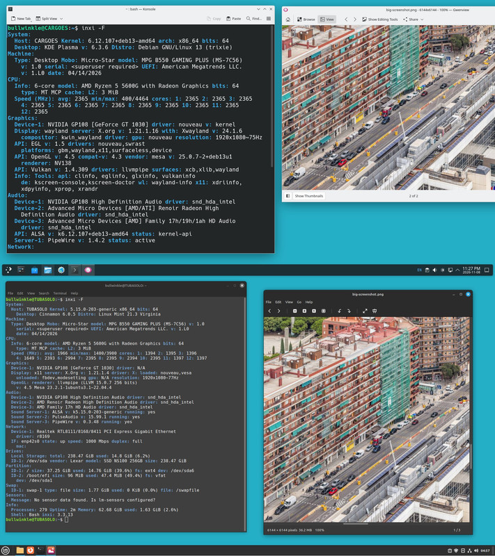
Is it possible that my HP laptop with an AMD chipset has a better picture with Debian KDE vs Mint 22.3 Cinnamon?
It sure looks like it.-a But of course the whole desktop is different too.
I dual boot and run Debian now and then.-a They both have the same wallpaper.
The graphics stack is too complicated, for anyone to really care
what the screen looks like. Is there any proof of a QA scheme
for proving no mistakes were made ?
A similar situation was motherboard sound subsystem. They used to
throw an HDAudio chip on the board and declare "job done". The noise
floor on these, no one at the factory was checking the noise floor.
They weren't using RightAudio or whatever, doing sweeps, looking
for harmonic distortion or noise floor.
This got a *lot* of feedback from users. Users were sick of
looking at a Sound Blaster card with a metal shield, and a
-110db noise floor, when the motherboard audio was -70db
(a lot more noise) and the noise happened to be "mouse noise".
The noise correlated with the mouse.
You will notice modern motherboards use an "analog island moat",
usually with a colorful silk screen line drawn on the board to show
the designer thought about having a moat. This does not guarantee
a good time, but in a number of cases, there is no "mouse noise"
correlation. The motherboard company also did put metal shields
over some of the designs (the metal shield is "worth 10db" on noisefloor).
The motherboard company is not interested in making all the
motherboards hit -110db noise floor. But they do try to suppress
the mouse noise case.
*******
On video, we are using compositing (COMPIZ was an example, as far
as I know). Wayland is an actual compositor, but I don't know
what that means, architecturally. It would seem the display stack
can be a compositor on its own, or a compositor can be bolted off
the side.
Compositing can be Z=axis priority. One window can be in front of
another. Using the Z-axis capability of the GPU, you can easily
obscure the parts of the program window, that we're not supposed
to see (because something is in front). In addition, the transparency
of windows can be controls. You'll notice Mint fooling around,
allowing some material behind a window to "leak through".
"Leakage via transparency setting, may degrade what you see, as a distraction"
OK, what other techniques are used. You might remember WinXP had
colored feathering around the letters. ClearType and ClearType Tuner.
https://img.utdstc.com/screen/e9c/9fa/e9c9fa177d129576e0c89298558ed6d1cf7d6d3725a2c709c66a9aa85b6068b8:800
(
https://cleartype-tuner-powertoy.en.uptodown.com/windows )
As far as I know, other ecosystems have replicated this.
The thing is, the panel of your screen, has a "layout" for the colored
dots that make a pixel. The One Laptop Per Child (OLPC) was an exception
to the usual monitors, in that it used a "different" layout. And if
the right color feathering method was not used, the results can be
"ugly". The reason ClearType would have six choices, is someone
thought LCD/LED panels had at least six layout choices.
Microsoft has managed on occasion, to have *three* different text rendering methods on-screen at the same time. One method is ancient and looks
terrible.
You can have color feathering (may also be referred to as "sub-pixel rendering"),
or there is also a monochrome version of that as well.
A low percentage of the population have "zebra eyeballs". Maybe 1% of users, the ClearType presentation, their eyeball and optic nerve, make way way
too much of the feathering. The feathering drives the user nuts,
and they don't realize that the person sitting next to them, is
not seeing the same thing they are seeing. So when two users compare
their screens, one will say "nothing to see here", and another will say
"man, this bothers me, it looks fuzzy". And their eyeball is used
to "scanning the horizon for predators". It's an inherited trait of
some sort.
So then, could a sub-pixel rendering scheme be screwing up your screen ?
I don't know. All I can do is make a few suggestions, as normally
we wouldn't have anything to talk about.
If your screen is not running at native resolution, that could cause
some fuzziness. the "scale setting" in some OSes, it can be good,
or, it can be very bad. As an example of weird stuff, I've been
getting some tearing in VirtualBox when the display setting in a guest
is set to 200%. On a hunch, the other day I took one of the defective
guests and I set the resolution to 170%. And the tearing stopped.
You know that the 1024x768 viewing mode ("I've got no driver" mode),
looks pretty bad on a 1920x1080 screen. Most users recognize they
are not running native and that's why one screen not only looks
worse, but circles are being rendered as ellipses.
One person on USENET coined the term "digital mutilation" to refer
to the overprocessing of interfaces. Could some other bad method
be in there ? Might it not be documented, named, or promoted ?
Maybe.
Paul
--- Synchronet 3.22a-Linux NewsLink 1.2